menu


Design system build
Paid Media expansion
Global guidelines build & delivery
Regional support & sign off
Dr. Martens


Visibility
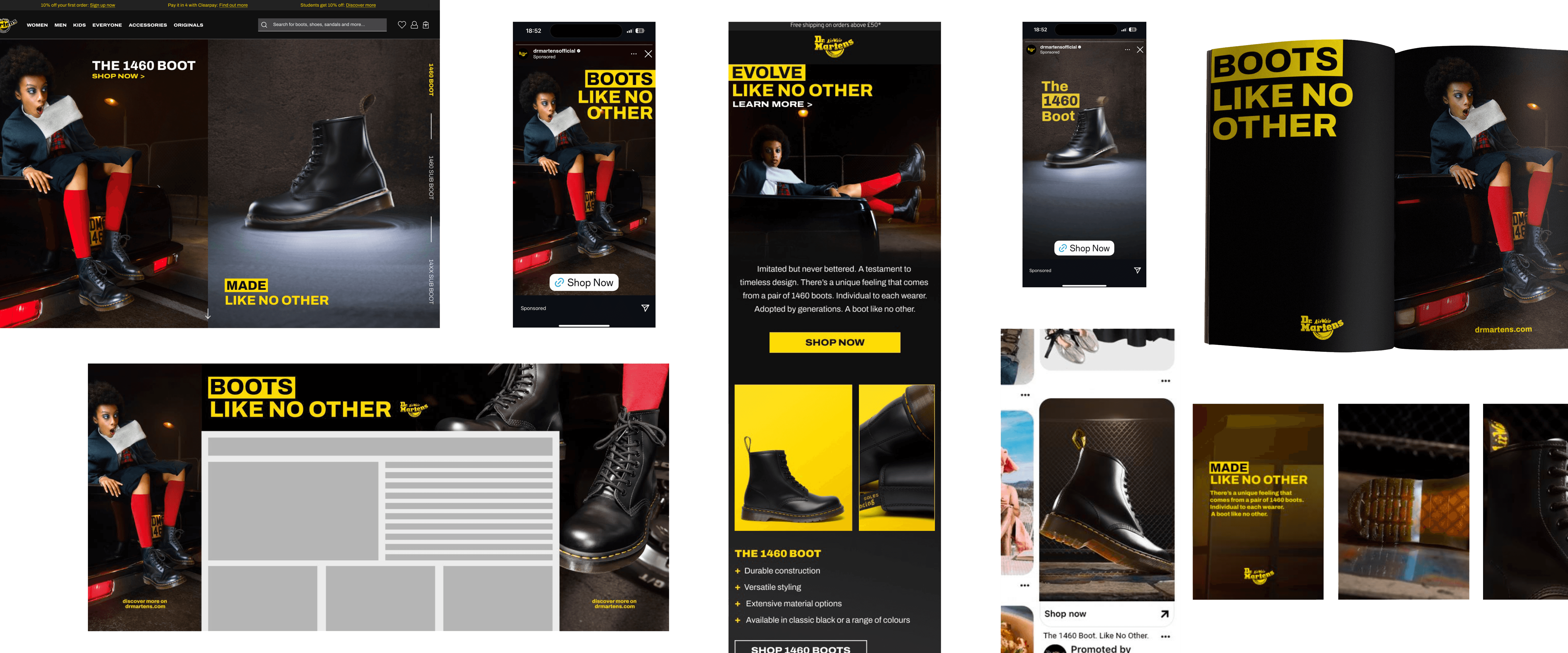
The imagery is dark, and from experience this leads to a poor performance; the text needs to do the heavy lifting, and to be seen from far away.
Recognition
Colour: I kept to our core yellow, to create instantly recognisable brand comms, whilst buliding the identity in markets with less awareness.
Using this portrait image, I can position the boot next to the logo for clear product identification on quick glances.
Versatile Execution
We have a secondary variable of the box, that does not bleed, for spaces with obstructed or uncertain borders.


